Role
Technical Lead & Data Engineer
Team
8 members
Period
March 2025 – May 2025
Status
Shipped
Tech Stack
Python, Dash, Flask, Plotly, pandas, SQLAlchemy, SQLite, SCSS
Tools
openpyxl, Flask-Caching, GeoJSON, Conda, Git
“A dashboard that turns DepEd's 60,000-school enrollment spreadsheets into a queryable warehouse, built around a normalization pipeline and an exploratory data analysis.”
Overview
Making Public Education Data Actually Public
The Philippine Department of Education publishes annual school-level enrollment data as large Excel workbooks with more than 60,000 rows and around 80 columns of student counts. Although the data is public and detailed, answering basic questions often requires manually building complex pivot tables and understanding how the columns map to grade, gender, strand, and location.
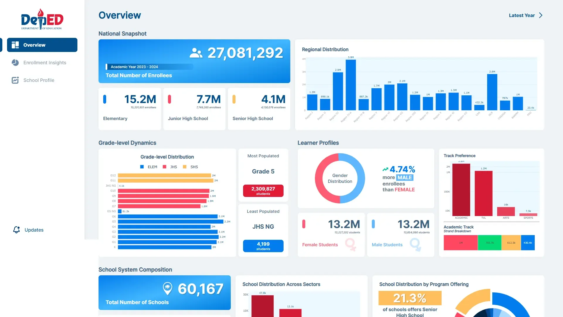
This project transforms those workbooks into a relational data warehouse with an interactive dashboard. Users can explore enrollment by location down to the barangay level, senior-high track and strand, school classification, and program offering.
Built as a six-week Big Data Analytics course project by a team of eight, the system was designed to make public education data easier to explore for researchers, planners, and students.
The Problem
A Simple Question, Buried in 80 Columns
DepEd’s workbook is a wide table designed to show each school’s data in one row. That works for browsing, but makes exploratory analysis difficult.
A question like how many girls are enrolled in STEM strands in Region VII? requires working across 60,000+ rows, building a pivot table, and knowing which of the 80 columns correspond to grade, gender, and strand. Ask a new question, and most of that work starts over.
The real problem sits deeper than the pivot table. Grade level, gender, and senior-high strand aren’t values in the data at all. They’re encoded directly into the column names:
K Male │ K Female │ G1 Male │ … │ G11 ACAD STEM Female │ … │ G12 ARTS MaleA spreadsheet can filter and group by a value. It cannot filter by half of a column heading. So every question that treats grade or gender as a category, which is nearly every interesting question, has to be answered by hand, from scratch, every time.
- Totaling one region means summing roughly 80 separate columns.
- Comparing boys against girls means knowing which of those 80 columns belong to which gender.
- Each new question rebuilds the pivot from zero. None of the work carries over.
The fix is straightforward: unpivot the wide table so grade, gender, track, and strand become queryable values instead of fragments of column names.
The actual work was making that hold up against a real government spreadsheet, where the header row sits at a different depth from year to year, and a purely elementary school still carries a full set of empty senior-high columns that a naive parser would assume were meant to hold data.
My Role
Technical Lead & Data Engineer
I was the technical lead and the data engineer on a eight-person team, which split into a project manager, data engineering, data science, and data analysis. My main responsibility was extracting data from Excel, transforming it into a structured schema, and serving it efficiently enough for the dashboard to query.
My contributions:
-
Built the ETL pipeline end to end, from workbook extraction through the seven wide-to-long transforms to the SQLite load.
-
Designed a seven-table schema built around a central enrollment fact table, with grade level and school details resolved through linked lookup tables. Kept it at this level rather than normalizing further, since a simpler backend was easier for the rest of the team to build against.
-
Wrote
smart_filter(), the single query function every chart on the dashboard reads through, and made it memoized so one filter change costs one database read rather than one per chart. -
Handled workbook inconsistencies by detecting header rows, resolving school years, normalizing location, masking counts outside each school’s declared offerings, and other considerations.
-
Created the frontend boilerplate and chart slots for the data analyst team, while also contributing to some frontend design to help complete the project.
I also coordinated the team’s branches and integration accross the team. With eight people working in parallel on the course project, keeping changes aligned was part of the job.
System Architecture
Three stages: ingest, query, present
Ingestion (runs on upload)
Query (runs on interaction)
Presentation
Why every chart shares one function. The dashboard has dozens of charts. Without this, each
chart would fire its own database query. Changing one filter could then trigger dozens of
near-identical queries at once, all asking for basically the same data. Instead, every chart calls
the same function, smart_filter(). The first chart to run it does the actual database work. Every
other chart just reuses that result instead of asking again.
Why the query is composed in three layers. smart_filter() builds its SQL in stages, one filter
at a time. First it filters by school details. Then it joins in location data. Then it combines elementary,
junior high, and senior high records into one result. Each stage only touches its own filters, so changing
one doesn’t disturb the rest. User input is never pasted into the SQL. It’s always passed in as a separate
parameter, which prevents SQL injection.
Why SQLite. I chose SQLite for its simplicity, the warehouse is a single file, no server to install or configure, which made it easy for an eight-person team to run locally within six weeks. It was also our first real database project as a team, and SQLite still handled the warehouse’s 1.58 million rows comfortably.
Key Technical Decision
One Builder, Three Grade Levels
Elementary, junior high, and senior high each needed their wide columns turned into long rows. The first version was grouped into three near-identical format, which is inconvenient to maintain.
They now share one builder, _melt_grade_counts(). The steps are the same for all three: select columns,
melt, tag gender, parse grade, combine male and female counts, merge in the enroll_id, cast types, stamp
the school year.
- Elementary and junior high differ only by their column mask (technically same).
- Senior high additionally parses track and strand off the full column name, before it can follow the same steps as the other two.
Two behaviors were deliberately preserved. Elementary drops empty counts
before the merge while the other two drop them afterward, which yields the same rows either way.
Strandless senior-high tracks such as TVL, SPORTS, and ARTS use an explicit __NaN__ sentinel to represent
a missing strand.
One tradeoff worth naming: three transforms write to the database mid-transform, which is normally a mistake. It’s necessary here, though, since SQLite only assigns each row its ID once it’s saved, so rows must be written and read back before anything else can reference them.
System Features
What the dashboard does
- Explores enrollment across four areas: location, senior-high track and strand, subclassification, and program offering. Each has its own page and filter set.
- Drills from region down to barangay. The location hierarchy runs region, province, division, district, municipality, barangay.
- Maps enrollment density across provinces, using per-region GeoJSON combined at render time.
- Ingests new school-year workbooks from inside the app. The App Settings page accepts an upload and streams the pipeline log live while it runs, so a five-stage ETL is not a silent wait.
- Gates access by role. Guests see the public overview; members reach the full analytics set. Restricted routes are enforced server-side in the callback, not only hidden in the navigation.
- Rebuilds from source in one command. Migrations are tracked in a
schema_migrationsledger, so running them twice is a no-op, and seeding is scoped to a named school year for reproducibility.
Tech Stack
What each layer runs on
| Layer | Choice |
|---|---|
| Ingestion | Python, pandas, openpyxl (extract, clean, seven wide-to-long transforms) |
| Warehouse | SQLite via SQLAlchemy; schema defined as models, applied through tracked migrations |
| Query | smart_filter() — parameterized three-layer SQL, memoized with Flask-Caching |
| Application | Dash on Flask, server-side sessions, role-gated routing |
| Visualization | Plotly Express and Graph Objects; GeoJSON choropleth |
| Styling | Hand-written SCSS compiled to CSS, Inter |
| Environment | Conda or venv, .env configuration read through one settings module |
There is no JavaScript build step. The interface is declared in Python and served as React by Dash, which let a team of mostly non-frontend students build a fairly dense dashboard without also learning a frontend toolchain in six weeks.
Results & Learnings
What shipped, and what I would rebuild
The warehouse holds 1.36 million enrollment rows across 60,167 schools in 18 regions for
S.Y. 2023-2024, or about 1.58 million rows across all seven tables. A full rebuild from the raw
workbook takes roughly 50 seconds and is reproducible from a clone with python setup.py.
The result is the thing the project set out to make true: a question about enrollment by gender, grade, strand, or province is now a filter selection instead of an afternoon of spreadsheet work.
Where it falls short, honestly:
- There is no test suite. The
test/directory is empty. The pipeline is verified by rebuilding from source and comparing row counts against a known baseline, which catches regressions but is not the same as testing the transforms. - Passwords are hashed with unsalted SHA-256. Adequate for seeded demo accounts on a coursework dashboard, not acceptable anywhere near real users.
load()deduplicates in memory. It reads the whole target table into a DataFrame to filter out rows that already exist. Correct, but it scales with table size rather than batch size. The project was meant to practice pandas, which is why it’s built this way. Suggested to useINSERT OR IGNOREwould let the database handle it instead.- The pipeline talks to the UI through a global. With the deadline closing in, transforms were made to write progress straight into a shared log_messages list, which the Settings page reads to stream live updates. It shipped on time, but it ties the pipeline directly to the UI. A cleaner fix would pass in a progress callback instead.
- The School Profile page was left unfinished when the course ended, and the schema was not normalized further than the team needed.
The lesson I took from it is about where the leverage sits. I expected the interesting work to be in the charts, and it was not. It was in the shape of the data underneath them. Once grade and gender were values instead of column headings, questions that had been afternoon-long spreadsheet exercises became one-line filters, and the analysts on the team stopped asking me to pull numbers for them. The single memoized query function did more for the dashboard’s responsiveness than any chart-level optimization would have.
Resources
Next case study